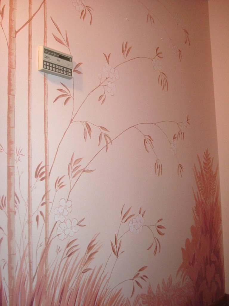
Monday, March 23, 2009

A Fantasy Garden


Big, beautiful, fantasy flowers will greet a baby girl each morning. As she grows older she will be able to identify the many creatures in her garden: a lizard, a lady bug, a caterpillar, a dragonfly and a butterfly.

Hearth and heart of the home


Simple but bold. This home owner was looking for a unique design that would work with the art above the mantle. She wanted the statement of the red, but not too much detail.

Tuesday, December 16, 2008

In the Jungle the mighty Jungle…


Not a lion, but a tiny girl sleeps here at night. One of the best things about a child’s room is the use of color! Orange and blue monkeys? Of course! Technicolor dreams are the most fun. To add a feminine touch, the chest of drawers features super-sized lilies.

Fore!


You have to be one heck of a golf fan (and have a very tolerant wife) to commit to having a course painted on the bulkhead in your kitchen. Okay, it is not actually a golf course; it is simply inspired by golf courses. ‘The Mrs.’ liked the look of golf courses but was not a golfer herself. That meant the flowing hills and manicured landscaping were approved; actual greens, sand traps and holes were not.

Nautical dreams


This nursery has a nautical theme. Mom and dad were on a budget, so I suggested a simple but very personalized approach. I used nautical flags to spell the little guy’s name. Children’s rooms are a favorite of mine because you can do a lot with a little, and I get to be really creative.

Best Distressed


A little cabinet makes a big statement with the right touch.

Thursday, December 11, 2008

Waves of Lavender


This couple loves original art! It is all over their home; making it all the easier to determine their style and what they appreciate visually. This guest bathroom was still in the making when I was finished, but my design reflected the vanity, mirror and graceful curve in the soon to be installed light fixture.

Story Time


Across town – a little girl, five years on the outside, helped her Mommy choose this storybook image. Mom loved the swing and I incorporated the chrysanthemum design that was on her big-girl bedspread.

Turle Love


A little baby girl was expected to fill this room with life and love. Her soon to be parents were told by many that their turtle theme was too masculine. I agreed with Mom and Dad - little girl does not have mean pink and frills! She’ll shatter the glass ceiling early with bold colors and high energy.

Wine Country


This home is owned by a sophisticated gentleman whom is leaving his signature in every room. In the kitchen, he was looking for a subtle grapevine design. Something to draw you closer rather than jump out at you the second you enter the room. The dark olive background was perfect as a slight camouflage for the old vine and its few bunches of grapes.

Saturday, March 08, 2008

A hallway with a view


This couple always wanted a window in their hallway. Costs were prohibitive due to all the ducts in the walls. Instead I painted them one. The view is a summer scene of what they would see if they did have a window in that very spot. As time goes on, they may have me do the other seasons, so this it on a board rather than on the wall. Change the season, change your view.

Modern lines


This house is very contemporary. The homeowner was considering faux finishes, but I suggested this clean lined design. She really loved it. The rays come to a point at the home’s main entry. They widen to draw you into the house towards the split level staircase. The photo is taken from the stairs that go down.

Garden view


I met with a mom who wanted to have something special done on her daughter’s armoire. As soon as I saw it, I knew I wanted to make the doors look like French doors looking out over a garden. I showed her two different designs and she liked the lake and the split rail fence in this one. The kitty “inside” the doors is their family pet.

Geometric accents


This homeowner had just finished renovating her bathroom and hired me to add the last special touch. I brought my idea sketched out. She liked it, but wanted to soften it just a little. In my original sketch the black lines were straight. The homeowner wanted to see them wavy, and wavy she went with.

Monday, December 18, 2006

Tropical Breezes


This client wanted to be reminded of vacations in Hawaii. I carved out a tiny forest in her foyer. This tone on tone oasis was built on her peachy pink background. Of course the small space made it impossible to get a good full view shot. Hopefully, you can get the idea from the many detailed photos.

Perfect for an entryway or hall


This little cabinet said country charm to me. I painted on a petite vine and leaf pattern, then sanded it a bit. Additional layers add to the distressed look.

Everyday at the Beach


In this bathroom, the background color is called ‘weathered glass’ and that inspired the whole look for these clients. The technique is called frottage. It utilizes either newspaper or plastic wrap to create a watery effect. One potential obstacle was the gold toned ceramic tiles that were not going to be replaced. I did not want the cool tone of the paint to fight with the warm gold. I added a layer of metallic gold paint to tie in the ceramic and fixtures, and add a little sparkle to the technique. Also see the artwork I created for their skylight.

Unconventional art


Once I heard about the plans to add beach themed accessories, all I could think about was sea glass and that beautiful skylight! I described my idea and they said ‘go for it’. Here is the result and of course photos do not do it justice. The light flows through the glass and casts shadows of the plants and shells. It is the perfect focal point hanging over their tub. Pull out the bubble bath and champagne!

Friday, October 13, 2006

Tortoise shell


I also really like tortoise shell. I have a pair of end tables that I created this effect on. This set is currently on sale either individually or as a pair at Paw Daddy’s Crafters Gallery in the North Hills area of Pittsburgh. I have a small booth there with a lot of small items for sale.

Faux Marble


I recently donated this end table to the Lung Association to auction off at an event. I mapped out the star pattern and then taped off the parts I was not working on. Needless to say, it took a very long time. Once all three marbles on the top were complete, I painted the front, sides and back black and finished it off with some antiqued gold accents. Finally, several coats of poly acrylic ensure its longevity.

Thursday, September 07, 2006

Inspired by a coffee break


This client knew she wanted a botanical presence in her dining room. We looked through books and magazines but nothing made her pulse quicken. We decided to take a coffee break. I commented on her pretty mugs. She said they were her favorite, a gift from a friend, and that she would be upset if they ever broke. They were white mugs with a yellow wash; the negative space was the look of bamboo. I suggested I use the mugs as a jumping off point and she was thrilled. Here is the finished product.

Making the most of architectural details


Modern homes often feature clean lines and open spaces, but that does not make them boring. Here we chose a wall that unites the living and dining room to accent. This intense blue wash was applied in three layers giving it depth and character. And no – the dark color did not make the space feel closed in.

Radical little dude


These surfer and snowboarder images replaced cute little bugs in the room of a cool little dude I had the pleasure of working with. He was five years old and way too hip for cartoon looking insects. We chose some pictures, I showed him a drawing and it was time to hang-ten (but we let mom think she got to give the final thumbs up).

Who would let me do this?


I have to admit – sometimes you gotta do what you gotta do and the fool who gave me carte blanche was me. That’s right, this Starry Night made into a mural is right behind me as I type. It is in my home office and I love it. I recognize that this is not for everyone, but I have always loved this painting, and a home office is a place that doesn’t have to follow any rules. It is a great place to express yourself (and fortunately my husband is just wacky enough to like it too).

Getting down to business


Here is a conference room in a local business. Interested in standing out from the crowd, the owners allowed me to put the line art from their logo into the finish. This is hard to see in the picture, but on the left side the line is extended to draw the eye toward their many awards and recognitions. Financial institutions just love lines!